A blog by Amanda
Tuesday, May 15, 2012
Andy Warhol project
Monday, May 14, 2012
People making a differnce Brad Pitt
For my second project I decided to do Brad pitt helping out in New Orleans. He's not just a celebrity he's a person that wants to make a difference and help those in need. I took a picture of New Orleans and placed it on top of pictures of Brad pitt working, I also included a quote from him. I really like the way this project turned out.
One person can make a difference Oprah Winfrey
For this project Tiffany Moira and I decided to work together and focus the six pictures on people that have made a difference in the world. The first person I chose was Oprah because she has done so much to help people around the world. She's one of my idols. I took four different pictures of her making a difference and put one of her quotes on the bottom of the project that I really like. This is one of my favorite projects I've done!
Tuesday, April 24, 2012
Hotel Rwanda Fear
I chose the word fear to represent the movie Hotel Rwanda. The story is based on fear and just fighting for you life. I took the word fear made it red and put it against a black background to make it stand out. I surrounded the word fear with pictures from the movie.
Hotel Rwanda movie cover
I was really touched by the movie Hotel Rwanda so for the cover I wanted to put a picture that really stood out to me. I found a quote that i really liked from Robert Ebert that gives a good review of the movie. Hotel Rwanda isn't just about violence it's a story about a man helping in a time of need.
Thursday, March 29, 2012
Find the three raisins
For this project I put three raisins in a background full of m&m's. I had to darken the rains and turn down the opacity of the raisins to make them less noticeable and blend in with the dark drown m&m's. I think it turned out well
Monday, March 26, 2012
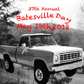
Batesville Day
For my batesville day t shirt design I took a picture of the old truck and put in against a picture of nature, full of trees. I wanted to make the picture look old like the truck so I put it all in black in white. I thought red looked good for the text, it stands out against the black and and white. I think it turned out well!
Subscribe to:
Comments (Atom)


